A Sans Serif uppercase font was chosen for greater impact. The "Boston Black" font was modified by increasing spacing to achieve a more refined and balanced appearance. Additionally, rounded corners were eliminated for a more imposing look.
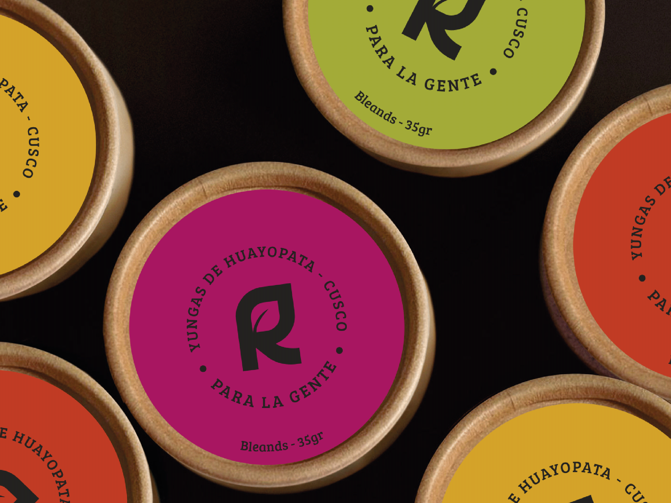
The goal was to radiate joy and diversity through a vibrant/versatile color palette that is perceived as friendly and inclusive to all kinds of people. For the typographic system, a sans serif font was implemented to keep a clean and modern vibe.
Additionally, a secondary color palette in pastel tones was implemented based on the primary palette. This allows the brand to have fewer limitations and more design possibilities.
The use of overlapped circles in various sizes is a key element of the brand, as it adds movement and conveys the cheerful and playful personality that it represents.


